Visual power seeks identity–Impressions of CXI_19
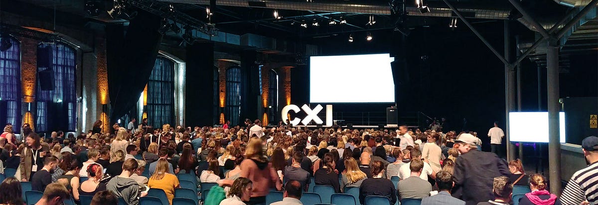
Brick meets Brand
Now in its 11th year, Europe’s largest conference on corporate and brand identity is taking place. The venue for this prestigious event was once again the Bielefeld Lokschuppen, a building from the early 20th century with brick walls and a deeply industrial look.
The CXI is organized by the Fachhochschule Bielefeld, in particular the Faculty of Design. With this educational institution as the organizer, it is therefore hardly surprising that students are primarily represented in the registration and indeed in the audience.
Once again this year, six pairs of speakers and three-person constellations took to the stage to represent agencies and their clients in various brand projects. The aim was to create a unique, comprehensive picture of both parties involved in said projects. After all, otherwise you only get to hear from one side.
FOMO tv | Kurppa Hosk
The CXI_19 kicked off with the conference’s only international speakers. Swedish design agency Kurppa Hosk, represented by Thomas Kurppa, and Stockholm-based gallerist, artist, and jack-of-all-trades Jonas Kleerup shared the highly creative and nostalgic process of finding FOMO tv’s identity.
Kleerup’s idea of a video streaming platform on the topic of FOMO (Fear Of Missing Out) might be difficult to understand in its approach and of questionable relevance apart from the artistic approach, but the intensity and quality of the design left nothing to be desired. With impressive showreels of the brand-in-motion, a style reminiscent of VHS tapes and a flexible logo concept reminiscent of MTV’s myriad of logo variations, Kurppa Hosk overwhelmed the audience with visual power.
Kleerup’s idea of a video streaming platform on the theme of FOMO (Fear Of Missing Out) might be difficult to understand in its approach and of questionable relevance apart from the artistic approach, but the intensity and quality of the design left nothing to be desired. With impressive showreels of brand-in-motion, a style reminiscent of VHS tapes and a flexible logo concept reminiscent of MTV’s myriad of logo variations, Kurppa Hosk overwhelmed the audience with visual power.
To do so, Kurppa Hosk applied her own snowball-like design process to branding, approaching a finished brand gradually but with increasing speed and complexity. An interesting process, but more akin to the waterfall model than agile design, which made one wonder if this approach might be less suitable for more commercial projects due to inflexibility, at least on the outside.

Volkswagen | think moto
We had the honor to be on stage with one of our clients again this year as an agency. Between late 2017 and mid-2018, we broke new ground and into new realities with Volkswagen.
To bring Generation X closer to the experience of car dealerships and shiny new cars, Volkswagen developed a series of applications for virtual reality and mixed reality. The basis of the applications was the possibility to bring different car models to the users in a playful and virtual way. The only thing missing was the smell of new cars.
The involvement of think moto started with the dissonance of many interaction patterns within these prototype-like applications. After all, no one had yet addressed the coherence of interactions across different realities. As a rule, there were hardly any applications that had to pass the test of brand conformity in both virtual reality and augmented reality. Our mission, therefore, was to create a unified pattern library to keep existing and future extended reality applications in line with other Volkswagen digital products.

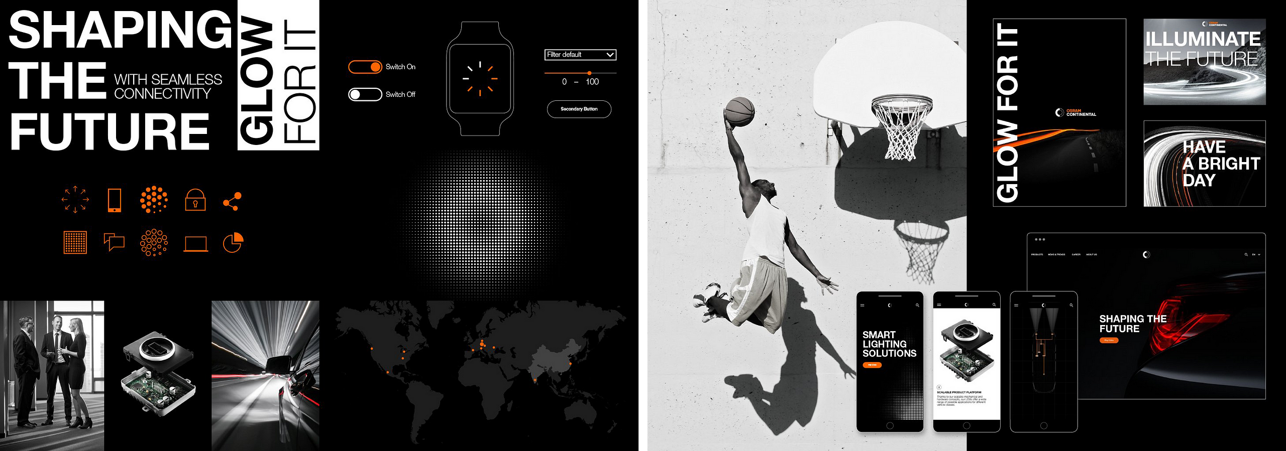
OSRAM Continental | KMS TEAM
When two people move in together, the household goods do not double. This was also the experience of Nadine Schian, Head of Communications, Marketing & Brand at OSRAM Continental. In a tough, three-year struggle, the joint venture between OSRAM and Continental built itself up on the basis of a technological partnership in the field of mobility lighting solutions and faced an important challenge in the process. As the brainchild of two down-to-earth and prestigious corporations, the task of finding its identity was either to follow in the footsteps of its parents or to break completely new ground.
This question was asked even before the actual founding of the joint venture, which for Vera Schnitzlein and the southern German agency KMS Team also meant: How do you build a brand without an existing company behind it? After all, nothing had been fixed yet, let alone signed.
Visually, therefore, basic elements of both brands were used. It was particularly important to find a color scheme for the colors that could stand alone but was derived from the parents.
For OSRAM Continental, however, the advantage of such an early start to finding an identity was above all that the corporation was able to launch on the first day after its official founding with around 1,500 employees on all continents and a fully developed, independent and expressive identity. A flying start for the young joint venture.
FC Bayern München | Interbrand
How do you tell an absolute Bayern Munich fan that his club’s favorite color is now yellow and green? You don’t. Philipp Mokrohs, the club’s lead brand strategist, and Alexandra Gövert of Interbrand told us about the problems of designing an incredibly emotional brand like the world’s most famous soccer club. In 2017, Gövert and her team were tasked with touching FC Bayern Munich’s identity and bringing it into the 21st century.
For a brand whose core values are all about tradition and heritage, change means putting on kid gloves for design. Major changes would have vehemently fallen victim to the emotions of millions and millions of fans, but at the same time Mokrohs reported a need for change. Evolution instead of revolution, was the motto.
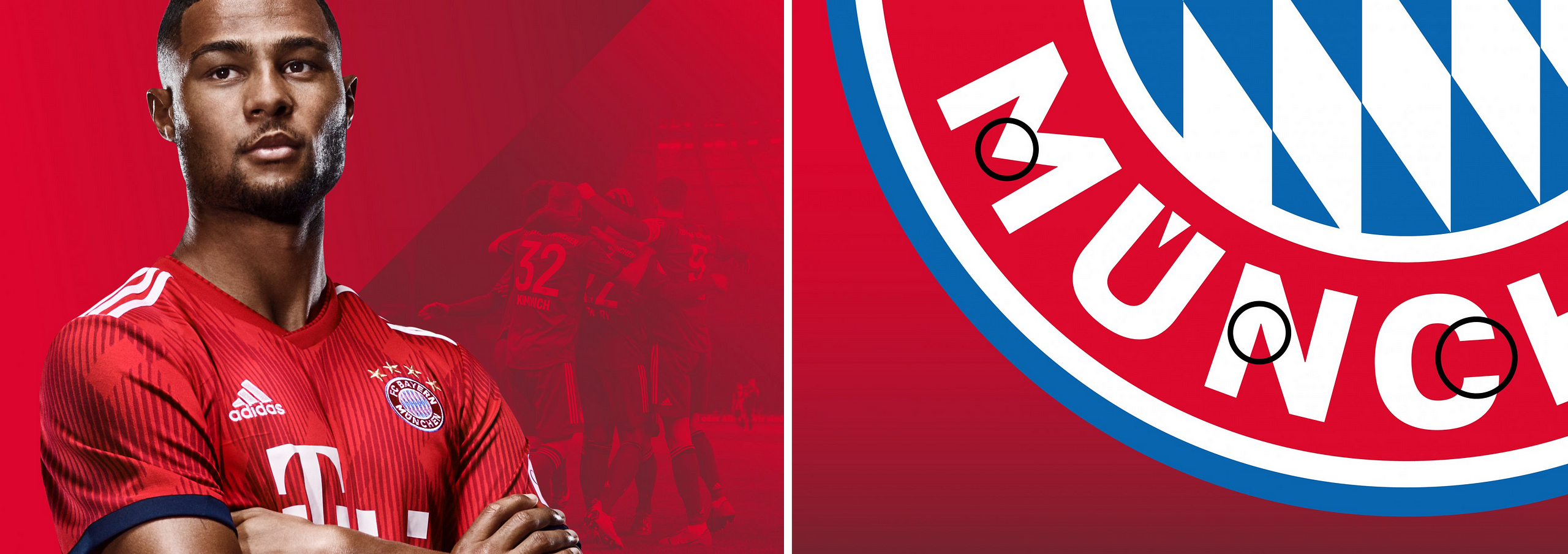
The logo, for example, which hadn’t been touched in decades, was in desperate need of craft help and was first freshened up by Alexandra Gövert’s team. This was followed by the introduction of various key visuals, the gradient in the background, and the cut and contrast of fonts and images. In the end, it became clear that the company also needed its own typeface to ensure a consistent brand presence in the future. This way, Bayern Munich is not only secure on the pitch, but also on the web (and other touchpoints).
sipgate | g31
Agile, lean and in sprints to success. That’s actually a good recipe, isn’t it? That’s what the Internet telephony provider sipgate and the small Düsseldorf agency g31 thought when they tackled the rebranding of sipgate. Before they got to that point, however, the two partners had already taken a turn.
When sipgate originally came to g31, the talk was of a brand refresh – not a complete rebranding with a new identity. A project that was to be tackled in the classic waterfall approach. After the guys and gals from g31 around Mats Kubiak and Paul Schoemaker had then locked themselves away for two months and worked out a concept to meet this requirement, it was time to present.
However, the concept presented did not seem quite right for Tim Mois and Tobias Ritterbach from sipgate. Instead, they wanted something completely new. To achieve this, they now relied on two-week sprints, lively exchanges and employee surveys. Thus, week by week, the company’s stale body with its dotcom look grew into a sleek bolide in black and white with colorful facets for the Internet telephony provider’s many different products.
The previously almost independent and not at all visually consistent products and sub-brands were now captured and merged into a whole via patterns, uniform logos and a holistic identity system.

DHL | Strichpunkt
After DHL had already completed a tough and elaborate redesign of the brand a few years ago, there was no question of allowing the logo, the colors or even the key visuals to be touched, brought on board Strichpunkt to give the yellow logistics brand new vigor.
Thick tomes of style guides, separate online portals for digital and print media, and a plethora of different layouts and touchpoints from airplane wrappings to advertising posters in the DHL branch, each with its own set of rules, had slowed down the logistics giant and now threatened to be unnecessary ballast for an agile future for DHL.
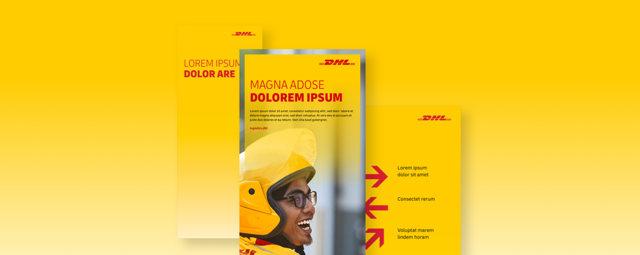
Strichpunkt recognized this quite correctly and worked to consolidate the visual components of the brand. A UI toolkit for developers now helps keep new digital products consistent across different devices and shortens development time enormously. The two heavily text-heavy and opaque Brand Portals became one with lots of images, examples and help. The font selection, which previously consisted of over a dozen typefaces, was replaced by the new house font “Delivery”.
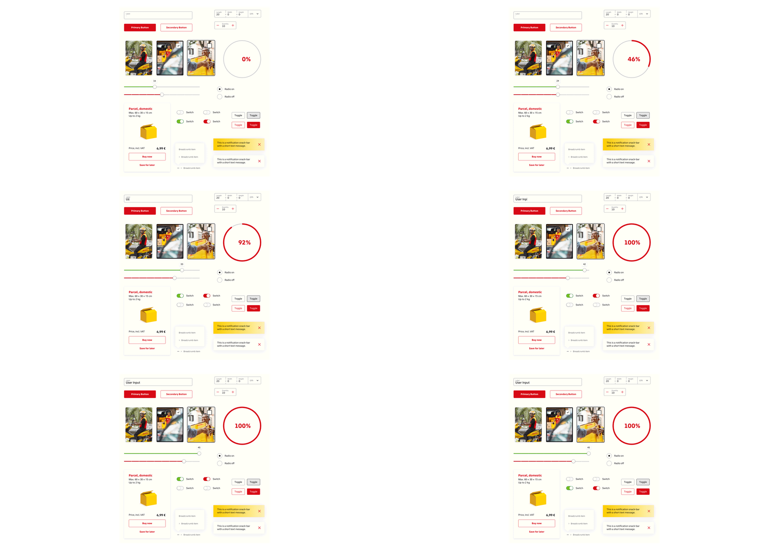
But probably the most impressive result from Strichpunkt was the creation of a layout generator, via which every DHL employee can easily create brand-compliant digital and print publications and products thanks to templates and guidelines. Just fill in the text fields, select images from the online library and you have a print-ready PDF in the highest quality and conforming to the brand from the choice of colors to the spacing.
Strichpunkt made all these changes under the concept of simplification. There should be flexible and universal principles and elements of design that can be applied across all touchpoints. And this has definitely been achieved. Good job, Strichpunkt!
Reduce and Recycle
The presence of flexible identities and living brands was to be expected at CXI_19 and did not disappoint. A simplicity of rules, reusable patterns and visuals, and a break with the separation between digital and print are leading principles of brand building and development in today’s world and in the foreseeable future.
The days of 200-page brand manuals and pixel-perfect media guidelines are numbered. Today’s brands can adapt, grow and survive. The brand is dead, long live the brand.